


Carrying purpose
through creativity.
More about me
Carrying purpose
through creativity.
More about me
Carrying purpose
through creativity.
More about me

Menu
Menu
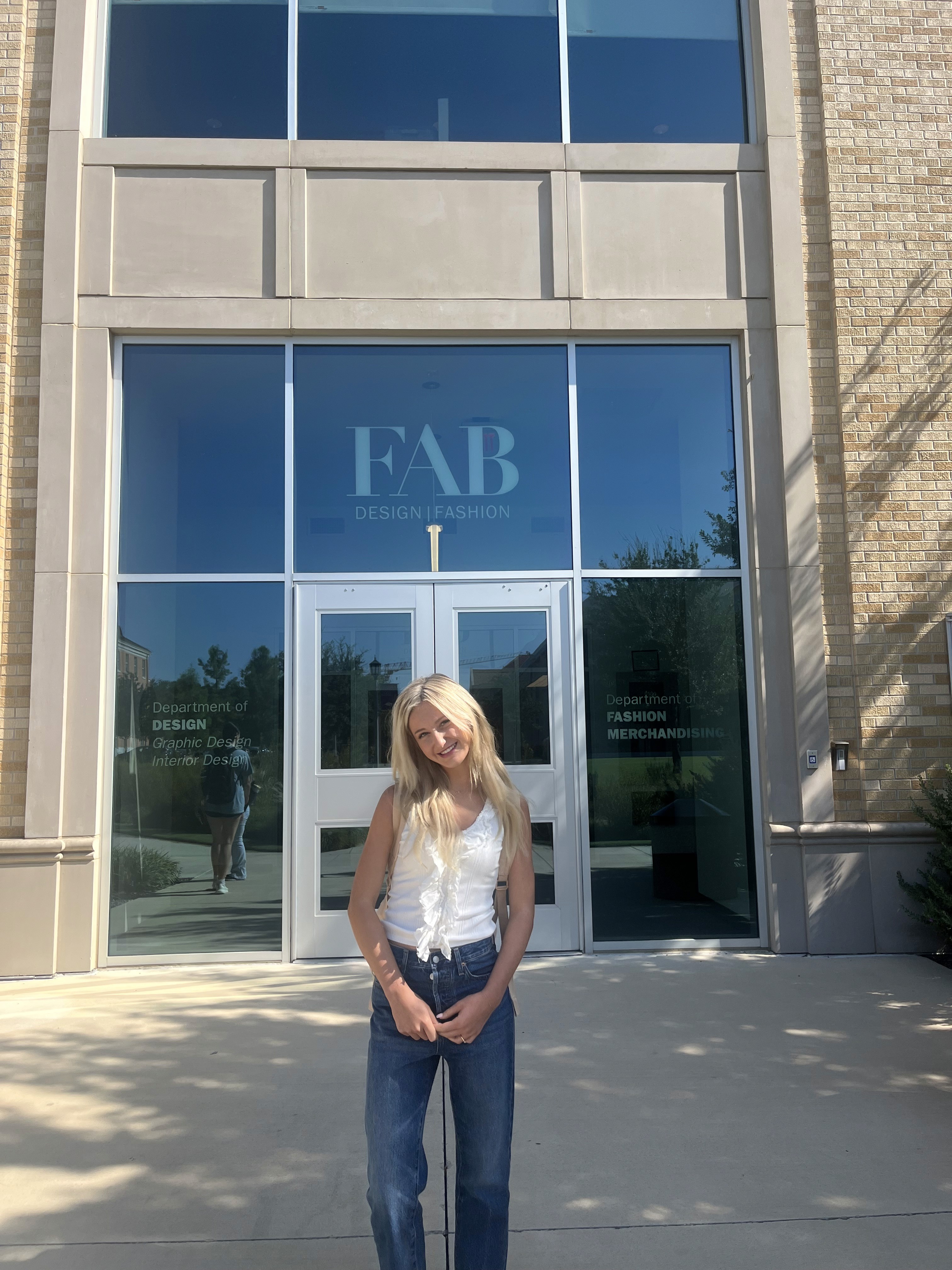
Hi, I'm Avery
I’m a junior Graphic Design BFA major at Texas Christian University in Fort Worth, Texas. While some people may have been iPad kids, I was the coloring book kid! Art and design have always been a core part of who I am. From directing Videostar and iMovie videos with friends to filling my mom’s purse (otherwise known as the “coloring book bag”), creativity has shaped the way I see and interact with the world.
As I grew older, I began combining visual storytelling with my artistic abilities and realized graphic design was the path meant for me. Today, I’m exploring branding, motion, advertising, packaging, UX/UI, and pattern design, with a strong interest in lifestyle, fashion, wellness, and creative-tech spaces.
I’m especially drawn to stationery and surface design and hope to work with brands like Papier, creating pieces that transform everyday paper goods into meaningful, lasting keepsakes. I love designing work that balances contemporary trends with timeless appeal, and design that feels intentional and emotionally resonant.
I’m open to where my creative journey leads, trusting God’s plan as I continue to learn and grow. Beyond design, I hope to use my skills to give back through community service and organizations like the National Charity League.
Thanks so much for stopping by!
I’m a junior Graphic Design BFA major at Texas Christian University in Fort Worth, Texas. While some people may have been iPad kids, I was the coloring book kid! Art and design have always been a core part of who I am. From directing Videostar and iMovie videos with friends to filling my mom’s purse (otherwise known as the “coloring book bag”), creativity has shaped the way I see and interact with the world.
As I grew older, I began combining visual storytelling with my artistic abilities and realized graphic design was the path meant for me. Today, I’m exploring branding, motion, advertising, packaging, UX/UI, and pattern design, with a strong interest in lifestyle, fashion, wellness, and creative-tech spaces.
I’m especially drawn to stationery and surface design and hope to work with brands like Papier, creating pieces that transform everyday paper goods into meaningful, lasting keepsakes. I love designing work that balances contemporary trends with timeless appeal, and design that feels intentional and emotionally resonant.
I’m open to where my creative journey leads, trusting God’s plan as I continue to learn and grow. Beyond design, I hope to use my skills to give back through community service and organizations like the National Charity League.
Thanks so much for stopping by!

01
Branding
My primary interest is branding and brand identity, where strategy and creativity intersect. I love creating visual systems that feel memorable and meaningful.
01
Branding
My primary interest is branding and brand identity, where strategy and creativity intersect. I love creating visual systems that feel memorable and meaningful.
01
Branding
My primary interest is branding and brand identity, where strategy and creativity intersect. I love creating visual systems that feel memorable and meaningful.

02
Packaging
I specialize in packaging design that is clean, considered, and brand-driven. My goal is to create packaging that stands out and feels purposeful in the hands of the consumer.
02
Packaging
I specialize in packaging design that is clean, considered, and brand-driven. My goal is to create packaging that stands out and feels purposeful in the hands of the consumer.
02
Packaging
I specialize in packaging design that is clean, considered, and brand-driven. My goal is to create packaging that stands out and feels purposeful in the hands of the consumer.

03
Advertising
Through playful visuals and thoughtful humor, I aim to spark instant connection with work that feels warm, memorable, and genuinely human.
03
Advertising
Through playful visuals and thoughtful humor, I aim to spark instant connection with work that feels warm, memorable, and human.
03
Advertising
Through playful visuals and thoughtful humor, I aim to spark instant connection with work that feels warm, memorable, and genuinely human.
My Creative Milestones


CarryOn expresses motion through an angled logotype suggests forward momentum, with a modified “A” subtly referencing a luggage handle. Royal blue conveys trust and premium quality, while bold yellow adds energy. Diagonal lines and translucent overlays reinforce movement, positioning CarryOn as a high-end, innovative transport service defined by motion and travel.
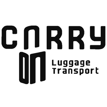
CarryOn expresses motion through an angled logotype suggests forward momentum, with a modified “A” subtly referencing a luggage handle. Royal blue conveys trust and premium quality, while bold yellow adds energy. Diagonal lines and translucent overlays reinforce movement, positioning CarryOn as a high-end, innovative transport service defined by motion and travel.
The CLANTZ logo suite creates a bold, futuristic identity across all platforms. Sharp geometry and orbital curves convey motion and energy, while a central star symbolizes impact. Modular versions ensure clarity on digital, stage, merchandise, and large-scale applications, establishing CLANTZ as a confident, high-energy electronic music brand.

The CLANTZ logo suite creates a bold, futuristic identity across all platforms. Sharp geometry and orbital curves convey motion and energy, while a central star symbolizes impact. Modular versions ensure clarity on digital, stage, merchandise, and large-scale applications, establishing CLANTZ as a confident, high-energy electronic music brand.
The Rise Bread Co. logo features a simple, illustrated loaf mark that feels tactile, imperfect, and human. Designed to be easily recognizable in busy urban settings, the logo balances confidence with warmth, staying rooted in tradition while feeling comfortable in modern spaces.

The Rise Bread Co. logo features an illustrated loaf mark that feels tactile, imperfect, and human. Designed to be easily recognizable in busy urban settings, the logo balances confidence with warmth, staying rooted in tradition while feeling comfortable in modern spaces.
The Life Links logo is elegant, timeless, and reassuring, reflecting both emotional and functional goals. A flowing script-style wordmark conveys warmth, femininity, and personal connection, helping the brand feel meaningful rather than medical. Soft curves communicate trust, value, and confidence, positioning Life Links as a fashion-forward solution that supports safety while honoring independence and dignity.

The Life Links logo is elegant, timeless, and reassuring. A flowing script-style wordmark conveys warmth, femininity, and personal connection, helping the brand feel meaningful rather than medical. Soft curves communicate trust, value, and confidence, positioning Life Links as a fashion-forward solution that supports safety while honoring dignity.
The Tabby Treats logo is playful, friendly, and fun, reflecting the personality of cats and the joy they bring. Rounded, inflated letterforms feel soft and treat-like, reinforcing indulgence and reward. A loose, hand-drawn style keeps the logo lighthearted and approachable for pet owners while clearly signaling a cheerful, cat-centric brand.

The Tabby Treats logo is playful, friendly, and fun. Rounded, inflated letterforms feel soft and treat-like, reinforcing indulgence and reward. A loose, hand-drawn style keeps the logo lighthearted and approachable for pet owners while clearly signaling a cheerful, cat-centric brand.
The Betterfly logo feels refined, confident, and aspirational, reflecting personal growth and polished social presence. A clean, modern wordmark balances elegance with warmth, while subtle details convey professionalism and trust. Its simplicity ensures versatility, positioning Betterfly as a quietly confident and empowering guide.

The Betterfly logo feels refined, confident, and aspirational, reflecting personal growth and polished social presence. A clean, modern wordmark balances elegance with warmth, while subtle details convey professionalism and trust. Its simplicity ensures versatility, positioning Betterfly as a quietly confident and empowering guide.
The first lettermark logo I designed for my own personal branding.
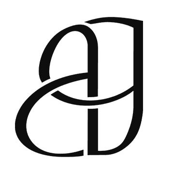
The first lettermark logo I designed for my own personal branding.
Moody Gardens in Galveston, Texas, is a family-oriented, non-profit destination known for its iconic pyramids housing an aquarium, rainforest, and museum. This rebrand emphasizes authenticity and purpose while introducing a contemporary aesthetic that elevates the resort’s visual identity. My goal is to reflect its vibrant beauty and upscale presence.

Moody Gardens in Galveston, Texas, is a family-oriented, non-profit destination known for its iconic pyramids housing an aquarium, rainforest, and museum. This rebrand emphasizes authenticity and purpose while introducing a contemporary aesthetic that elevates the resort’s visual identity. My goal is to reflect its vibrant beauty and upscale presence.
The Tabby Treats logo is playful, friendly, and fun, reflecting the personality of cats and the joy they bring. Rounded, inflated letterforms feel soft and treat-like, reinforcing indulgence and reward. A loose, hand-drawn style keeps the logo lighthearted and approachable for pet owners while clearly signaling a cheerful, cat-centric brand.
The Tabby Treats logo is playful, friendly, and fun, reflecting the personality of cats and the joy they bring. Rounded, inflated letterforms feel soft and treat-like, reinforcing indulgence and reward. A loose, hand-drawn style keeps the logo lighthearted and approachable for pet owners while clearly signaling a cheerful, cat-centric brand.
The Betterfly logo feels refined, confident, and aspirational, reflecting personal growth and polished social presence. A clean, modern wordmark balances elegance with warmth, while subtle details convey professionalism and trust. Its simplicity ensures versatility, positioning Betterfly as a quietly confident and empowering guide.

The Betterfly logo feels refined, confident, and aspirational, reflecting personal growth and polished social presence. A clean, modern wordmark balances elegance with warmth, while subtle details convey professionalism and trust. Its simplicity ensures versatility, positioning Betterfly as a quietly confident and empowering guide.
The first lettermark logo I designed for my own personal branding.
The first lettermark logo I designed for my own personal branding.
Moody Gardens in Galveston, Texas, is a family-oriented, non-profit destination known for its iconic pyramids housing an aquarium, rainforest, and museum. This rebrand emphasizes authenticity and purpose while introducing a contemporary aesthetic that elevates the resort’s visual identity. My goal is to reflect its vibrant beauty and upscale presence.
Moody Gardens in Galveston, Texas, is a family-oriented, non-profit destination known for its iconic pyramids housing an aquarium, rainforest, and museum. This rebrand emphasizes authenticity and purpose while introducing a contemporary aesthetic that elevates the resort’s visual identity. My goal is to reflect its vibrant beauty and upscale presence.
The Carry On rebrand expresses motion through typography, color, and dynamic elements rather than traditional symbols. An angled logotype suggests forward momentum, with a modified “A” subtly referencing a luggage handle. Royal blue conveys trust and premium quality, while bold yellow adds energy. Diagonal lines and translucent overlays reinforce movement, positioning Carry On as a high-end, innovative transport service defined by motion and travel.
The Carry On rebrand expresses motion through typography, color, and dynamic elements rather than traditional symbols. An angled logotype suggests forward momentum, with a modified “A” subtly referencing a luggage handle. Royal blue conveys trust and premium quality, while bold yellow adds energy. Diagonal lines and translucent overlays reinforce movement, positioning Carry On as a high-end, innovative transport service defined by motion and travel.
The CLANTZ logo suite creates a bold, futuristic identity across all platforms. Sharp geometry and orbital curves convey motion and energy, while a central star symbolizes impact. Modular versions ensure clarity on digital, stage, merchandise, and large-scale applications, establishing CLANTZ as a confident, high-energy electronic music brand.
The CLANTZ logo suite creates a bold, futuristic identity across all platforms. Sharp geometry and orbital curves convey motion and energy, while a central star symbolizes impact. Modular versions ensure clarity on digital, stage, merchandise, and large-scale applications, establishing CLANTZ as a confident, high-energy electronic music brand.
The Rise Bread Co. logo features a simple, illustrated loaf mark that feels tactile, imperfect, and human. Designed to be easily recognizable in busy urban settings, the logo balances confidence with warmth, staying rooted in tradition while feeling comfortable in modern spaces.
The Rise Bread Co. logo features a simple, illustrated loaf mark that feels tactile, imperfect, and human. Designed to be easily recognizable in busy urban settings, the logo balances confidence with warmth, staying rooted in tradition while feeling comfortable in modern spaces.
The Life Links logo is elegant, timeless, and reassuring, reflecting both emotional and functional goals. A flowing script-style wordmark conveys warmth, femininity, and personal connection, helping the brand feel meaningful rather than medical. Soft curves communicate trust, value, and confidence, positioning Life Links as a fashion-forward solution that supports safety while honoring independence and dignity.
The Life Links logo is elegant, timeless, and reassuring, reflecting both emotional and functional goals. A flowing script-style wordmark conveys warmth, femininity, and personal connection, helping the brand feel meaningful rather than medical. Soft curves communicate trust, value, and confidence, positioning Life Links as a fashion-forward solution that supports safety while honoring independence and dignity.


Contact
Let’s start a conversation
Feel free to reach out at any time.

Contact
Let’s start a conversation
Feel free to reach out at any time.
Contact
Let’s start a conversation
Feel free to reach out at any time.